

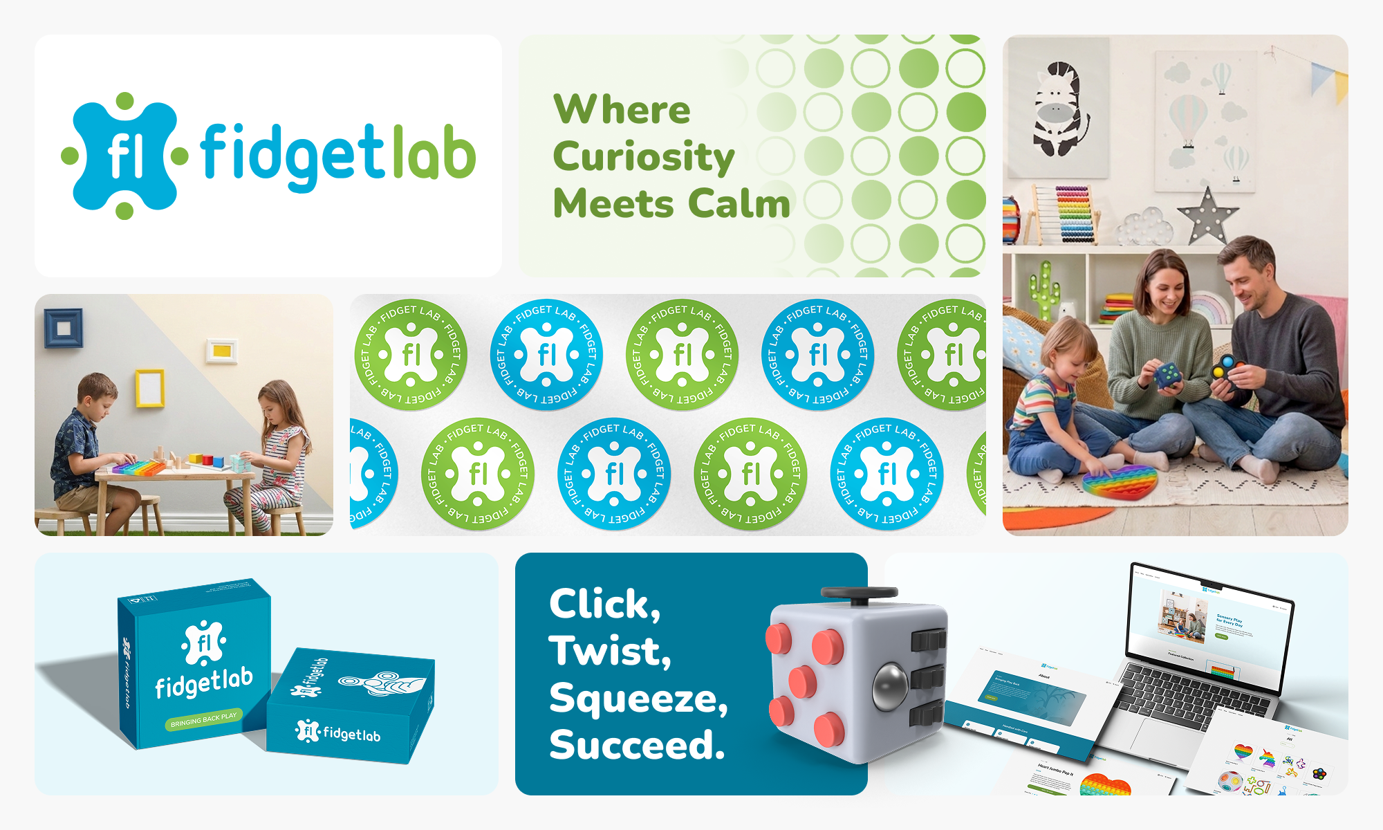
Fidget Lab had a strong product concept but no brand identity, no website, and no way to reach parents searching for sensory and developmental toys for their kids. As a self-funded startup entering a fast-growing market, they were invisible online.
Awareness around ADHD, anxiety, and sensory needs in children was growing, and so was demand for products that could help. Fidget Lab had the right products for the moment. They just needed a brand and a digital storefront that could build trust and drive sales.
To design a complete brand identity system and responsive e-commerce website from the ground up, built on research and strategy rather than assumption. The goal was to give Fidget Lab a visual language and online presence that could hold its own in a competitive market, resonate with their target audience, and support the business from day one of launch.
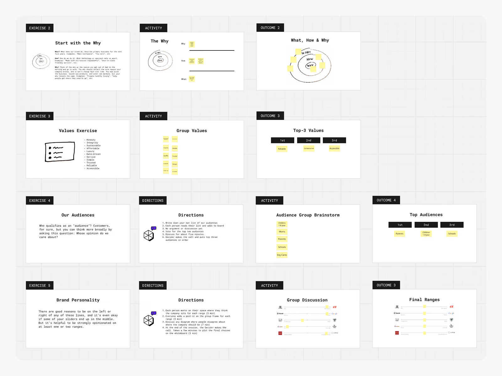
Before opening any design software, the client and I ran a brand sprint together. We worked through a series of exercises to define the company's purpose, agree on core values, and identify who we were designing for. The sprint landed Fidget Lab firmly in mass appeal, playful, and young and innovative territory. Approachable and fun, not clinical or exclusive.
Key Insights
Top values: Reliable · Collaborative · Accessible
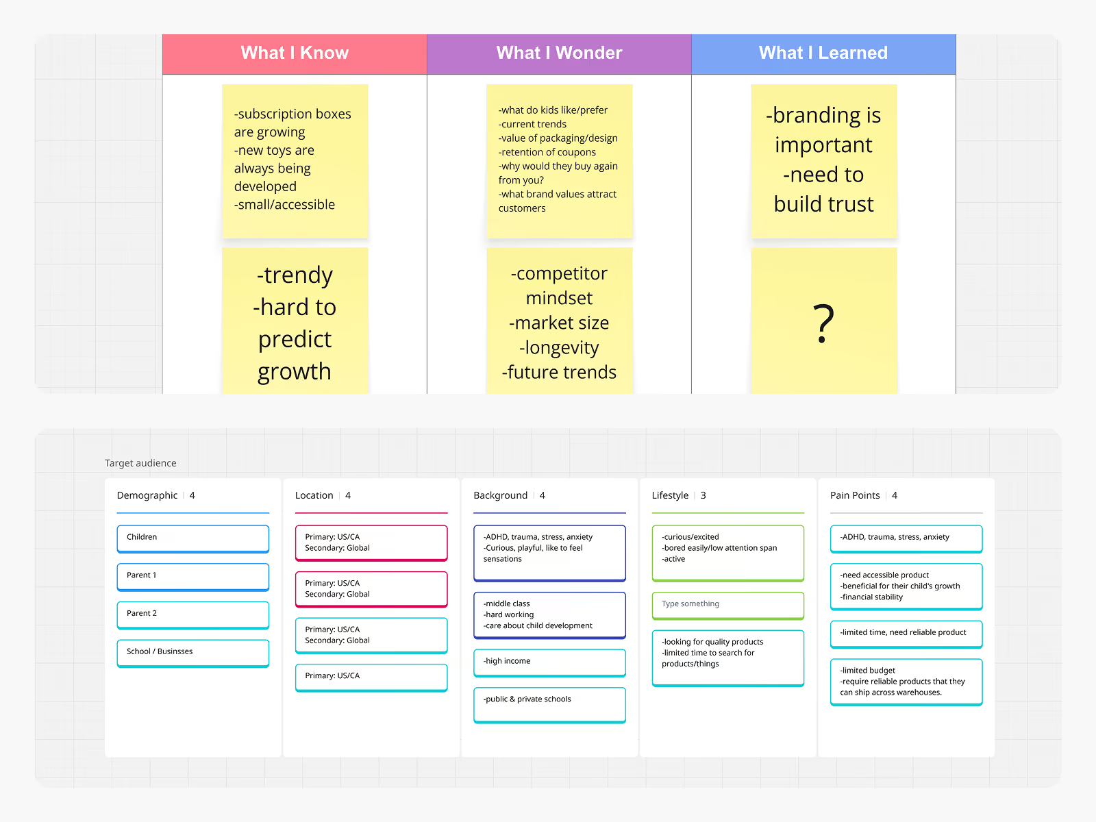
Priority audiences: Parents (buyers) · Children 1–8 yrs (end users) · Schools and Business
A KWL exercise helped surface a key tension early on. The toy market is trend-driven and hard to predict, and for a startup with no track record, the brand itself would need to do a lot of the trust-building work. The audience research confirmed that parents make the purchase, but children influence it. The brand needed to speak to both at the same time.
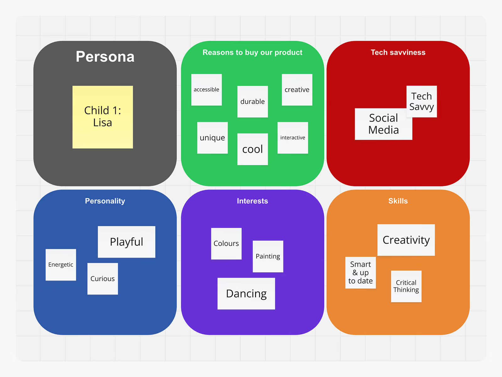
We defined Lisa, a playful, curious, creative child aged 1 to 8, to keep design decisions grounded in a real person. One clear principle came out of it: if the product does not delight the child, the parent will not reorder.
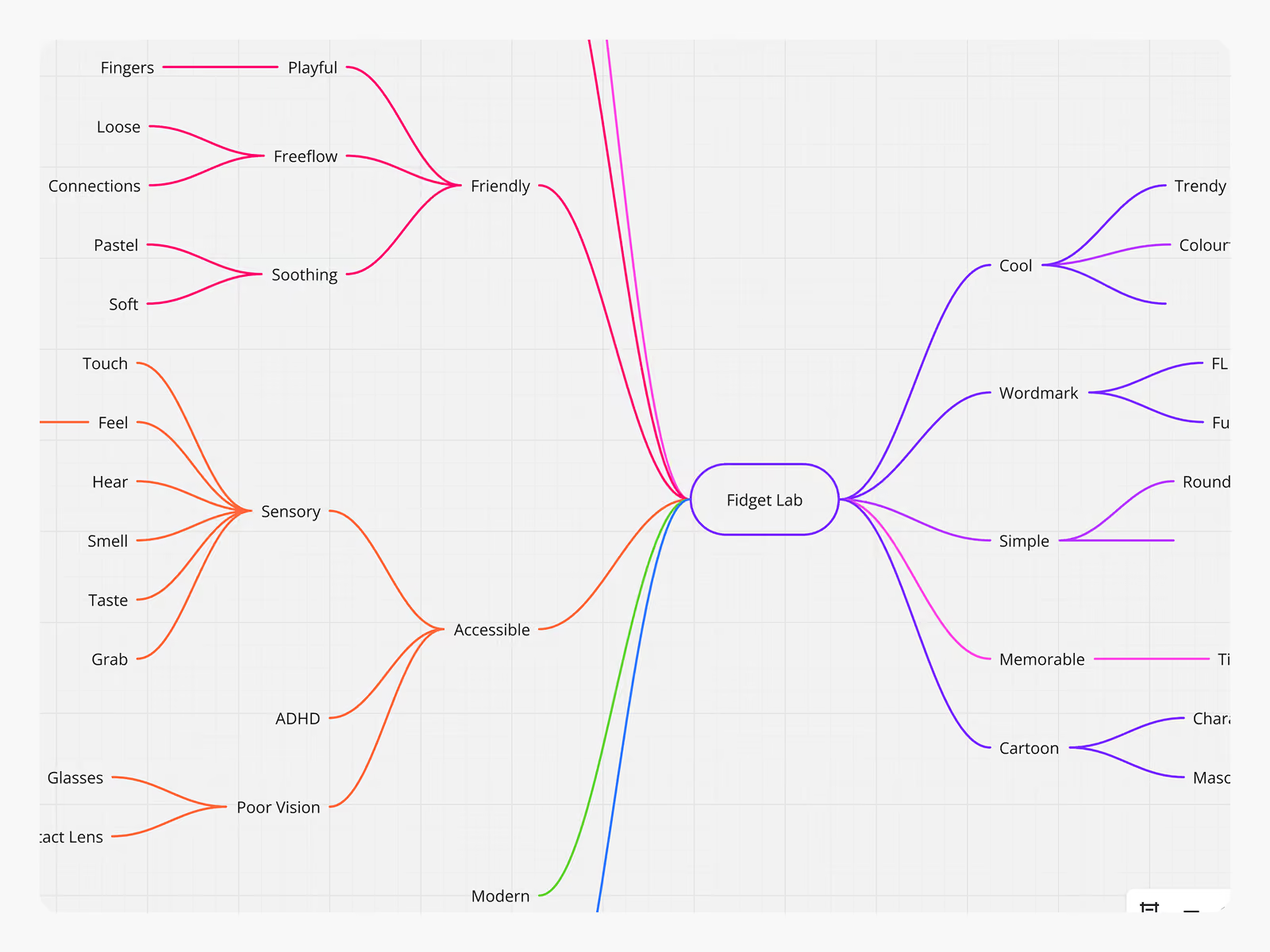
Mind mapping helped explore what Fidget Lab could look and feel like visually, covering territory from Friendly and Playful to Sensory and Laboratory. Three stylescape directions came out of that process, each taking a different angle on the brand's personality.
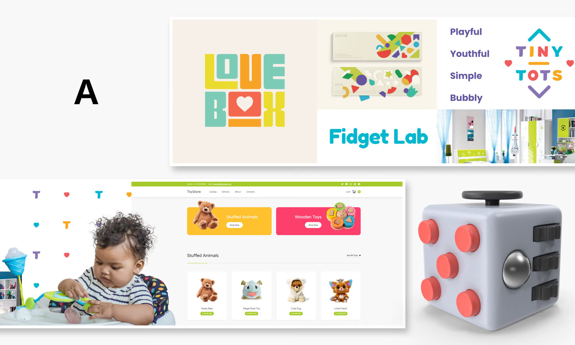
Direction A leaned fully into bold and playful. Saturated primary colours, chunky rounded type, and high-energy visuals that felt made for kids as much as for parents browsing online. It drew from the world of toys directly; colourful, tactile, and fun. This direction reflected the brand sprint values most literally, putting accessibility and energy front and centre.
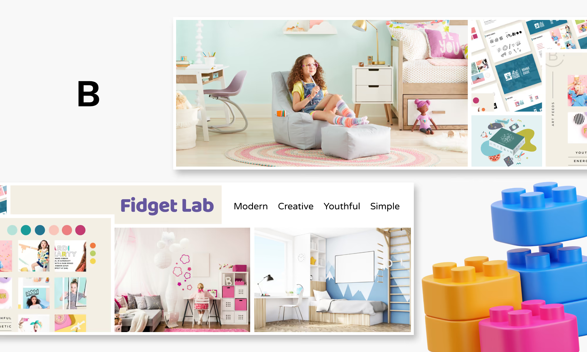
Direction B took a step back from that energy in favour of something cleaner and more considered. A pastel-accented palette, contemporary typography, and a more editorial layout gave this direction a modern sensibility. It spoke to parents as much as children, positioning Fidget Lab as a brand that takes child development seriously while still feeling warm and approachable.
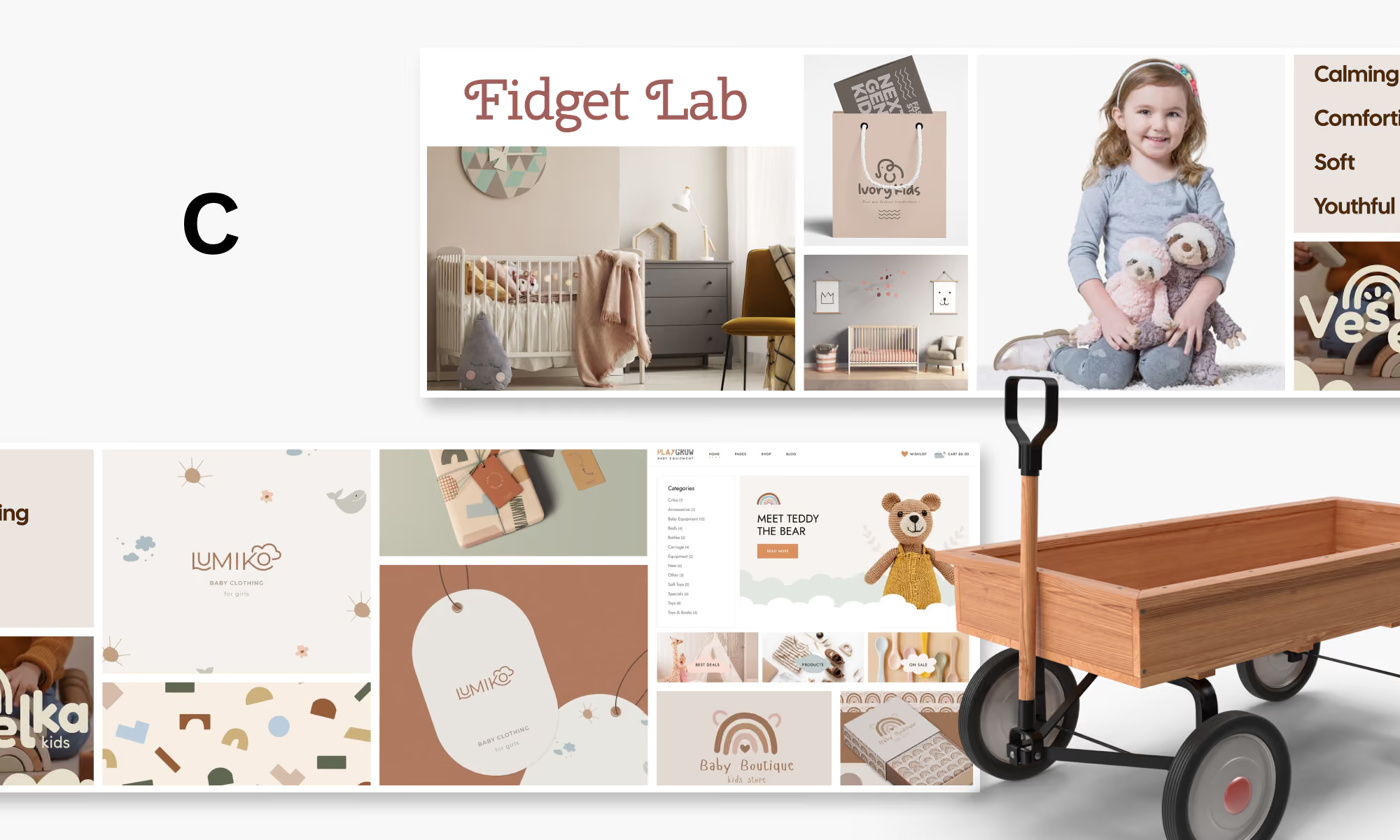
Direction C moved into premium territory. Warm earth tones, soft naturalistic colours, and a calm visual rhythm gave this direction a boutique quality closer to high-end baby and children's lifestyle brands. It communicated trust and craftsmanship, and would have set Fidget Lab apart from the louder end of the toy market.
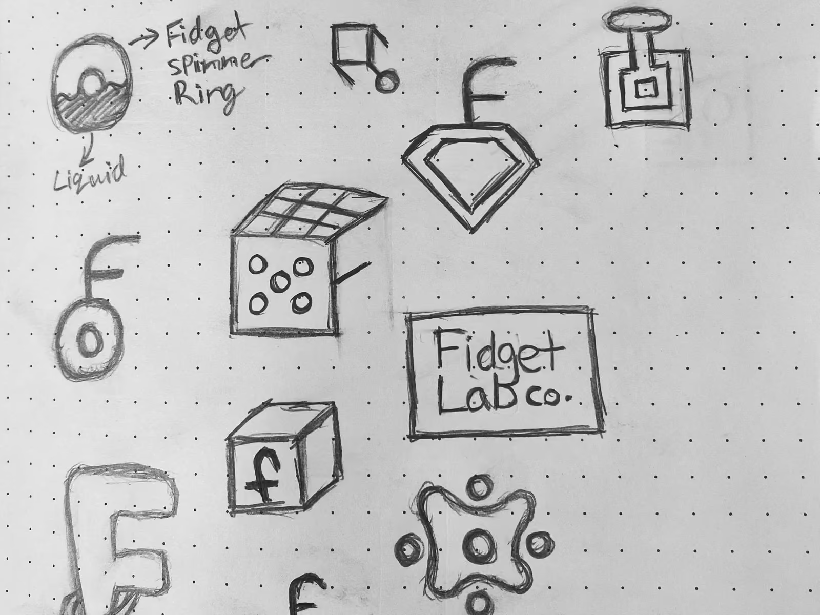
Early sketches pulled from the product world directly: fidget cubes, spinner rings, Rubik's cube forms, liquid shapes, and letterform studies. Some ideas were typographic, others icon-driven. The bottom right of the sheet shows the earliest version of what became the final mark: the four-lobed blob shape with dots, already starting to take form.
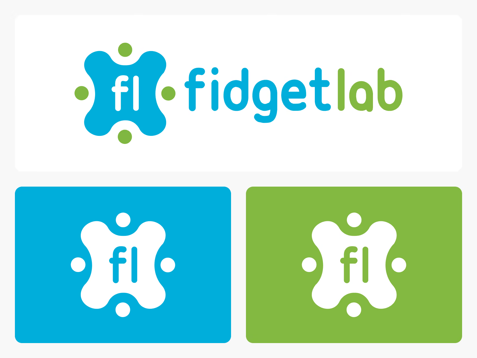
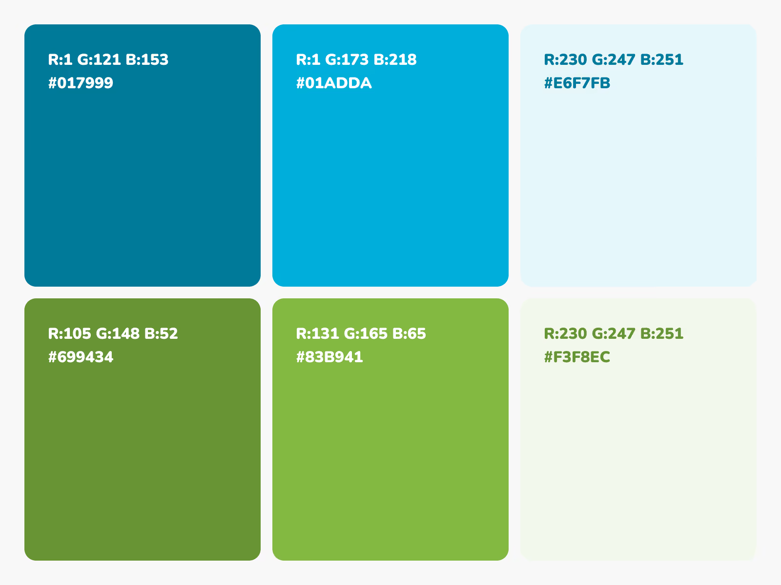
The final logo brings together the two sides of the brand name in one mark. The blob like shape references a fidget spinner in motion, the dot accents nod to a science experiment bubbling away, and the two-colour wordmark ties it together. Playful, legible, and on-brand.
While not chosen, they had unique visual characteristics that the client found interesting, making it difficult to choose just one.
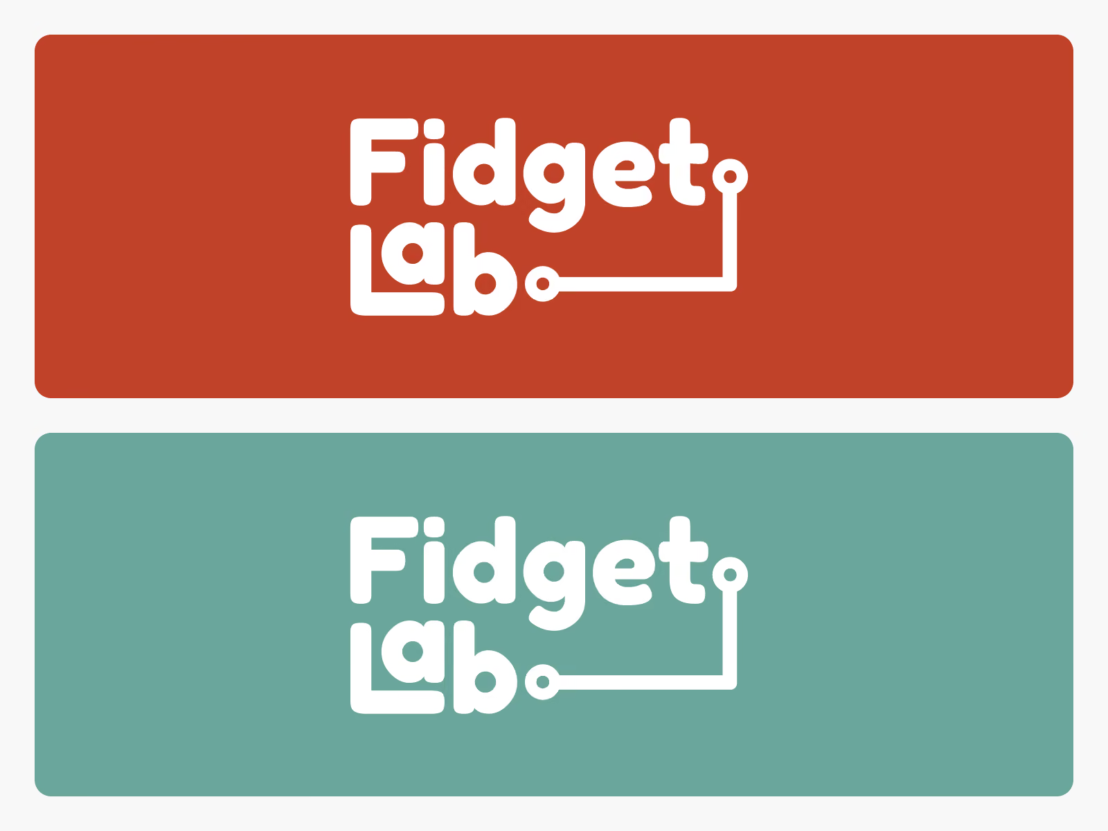
A wordmark with a circuit-style line extending from the letterforms, referencing fidget toy connection points and the idea of bridging children with communities. The stacked type also carries a subtle secondary read; the front cabin of a toy train.
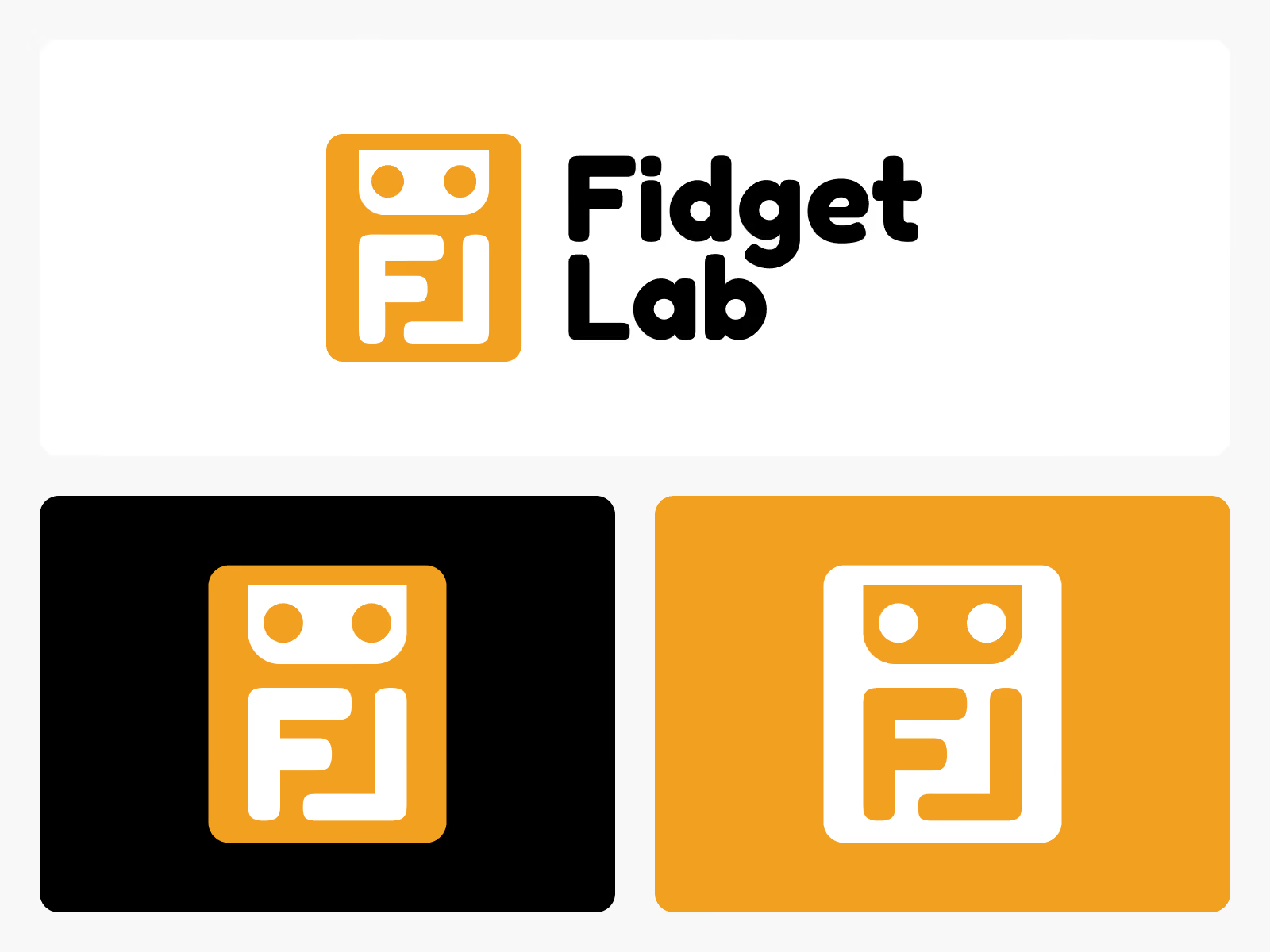
The "FL" initials designed as a geometric icon with a toy robot face hidden inside. Subtle enough that it doesn't land immediately, but once it clicks, it sticks. That moment of discovery was the highlight of the presentation.
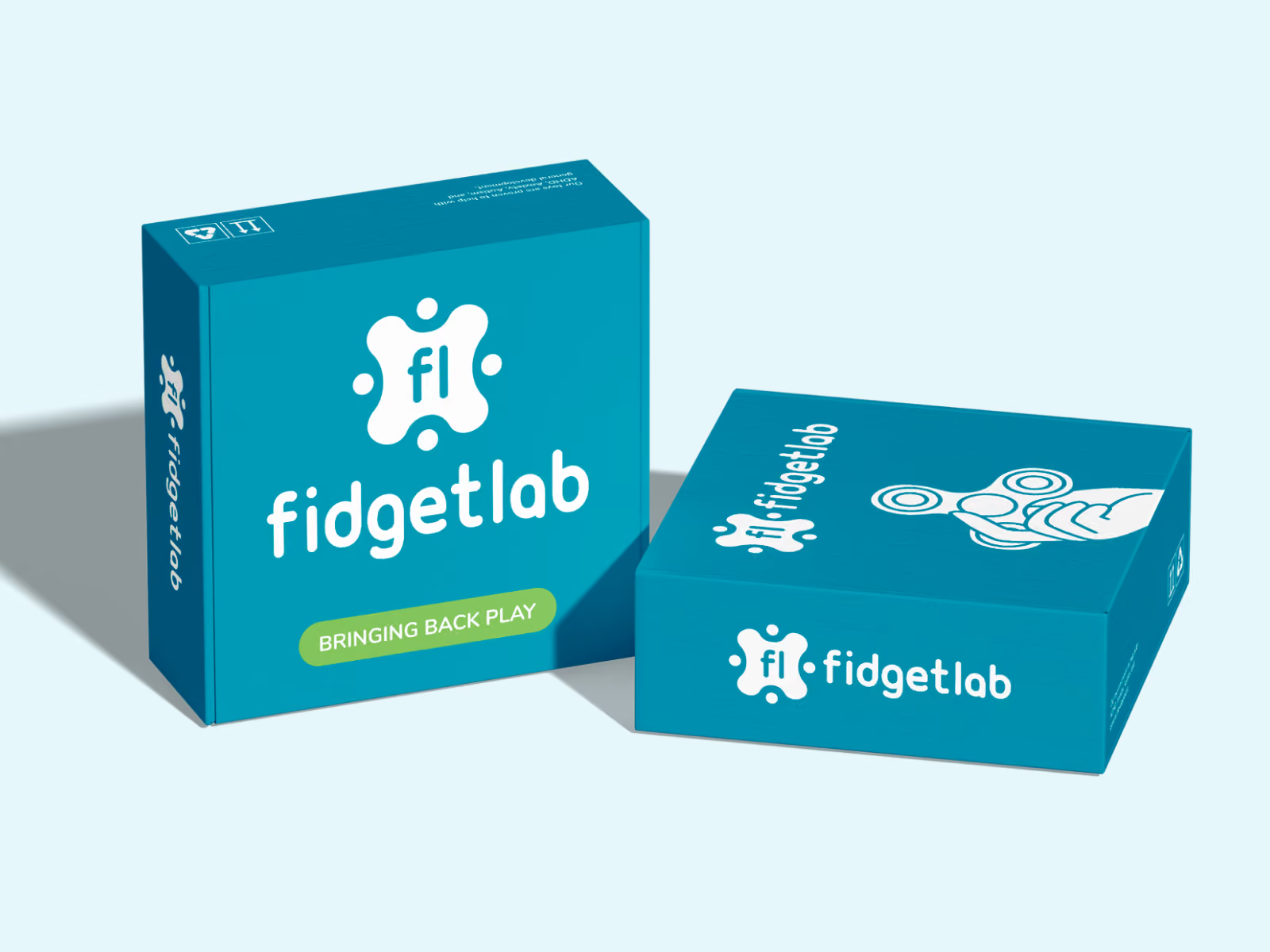
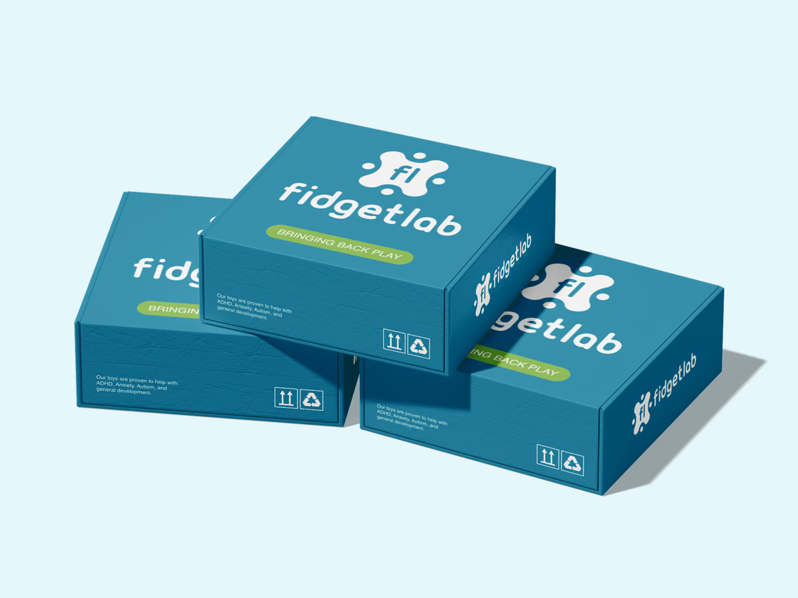
Deep teal on all faces with the white logo and wordmark centred on the front. A green pill badge carries the tagline. A circular sticker badge system was built for inserts and product labelling. The goal was packaging that feels like the holidays when it shows up at the door.
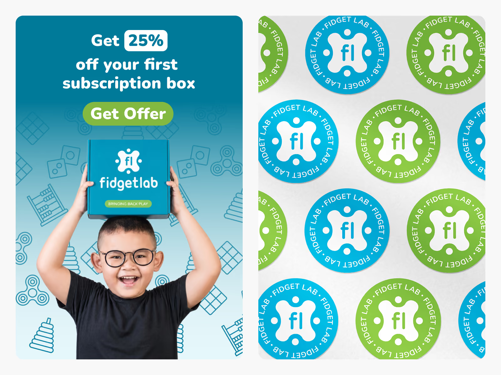
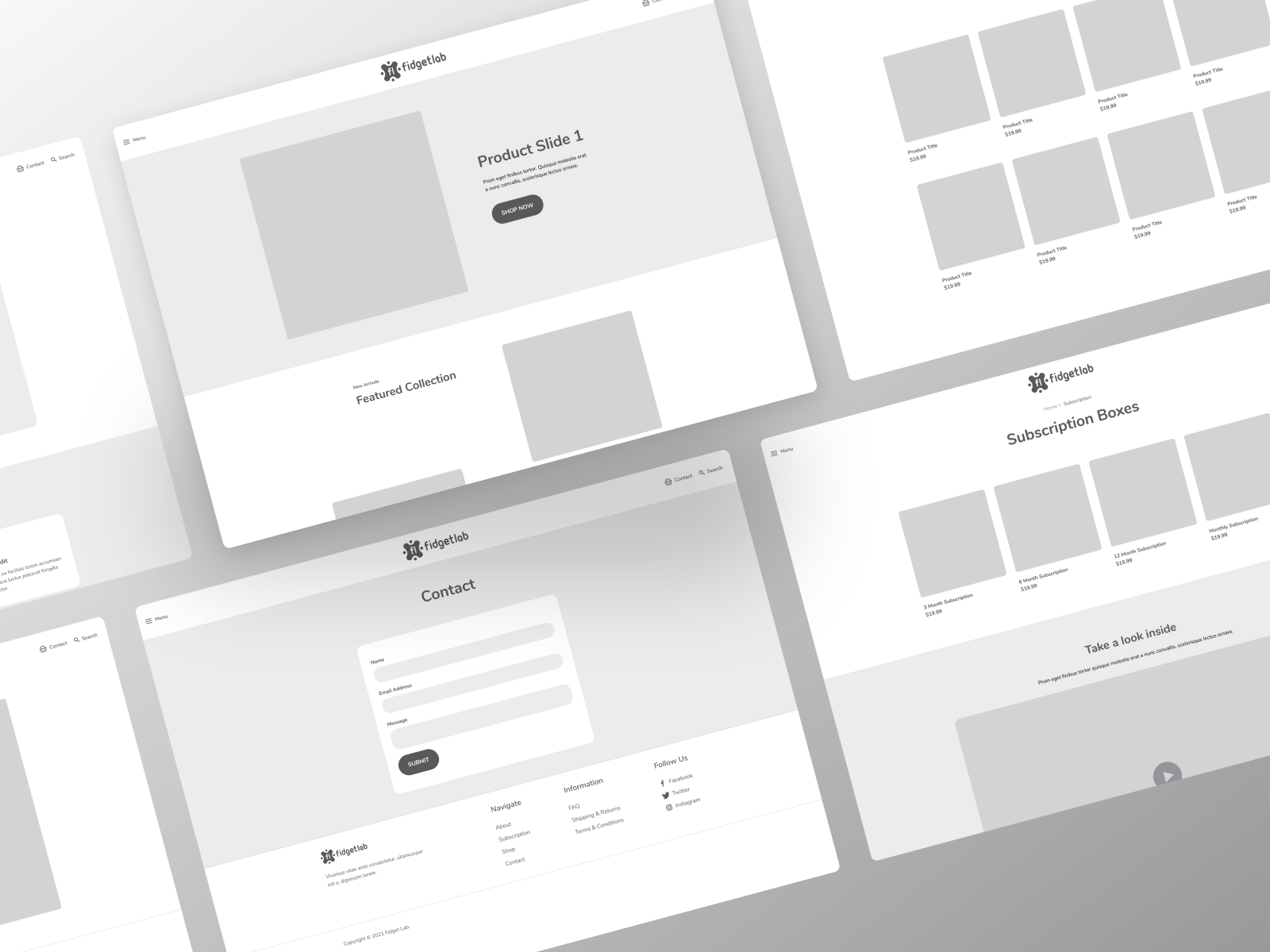
Since we were using Shopify to develop the final website, we used a theme to determine the overal structural look during the wireframing stage. Each section customized and tailored for the Fidget Lab experience.
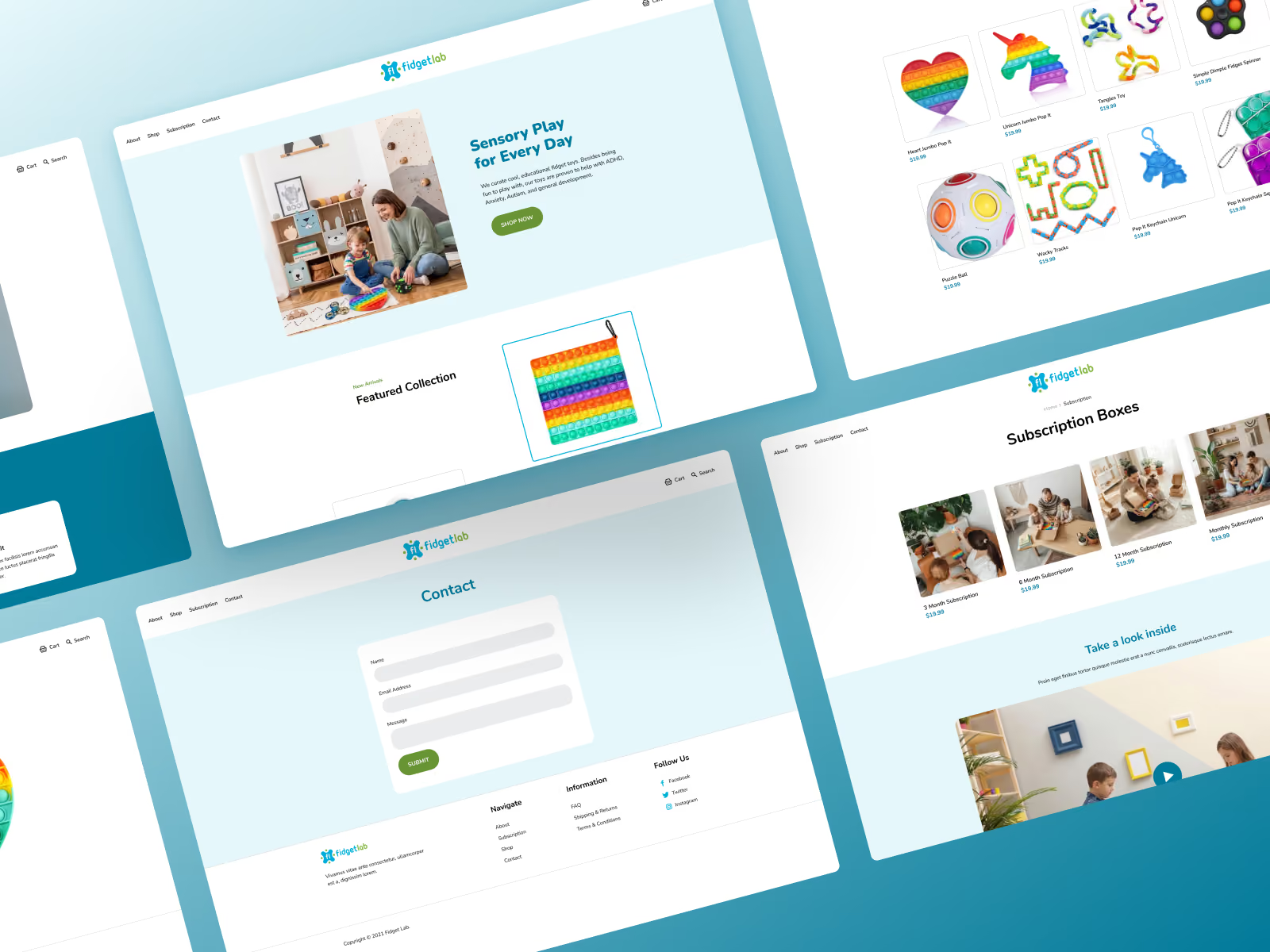
Designed to support two revenue streams: individual product sales and subscription boxes. The homepage opens with a lifestyle image of a parent and child playing together, which sets the emotional tone before any copy is read. The layout keeps things simple so browsing and buying stay straightforward. Teal and green run consistently across every page, keeping the experience tied back to the brand.
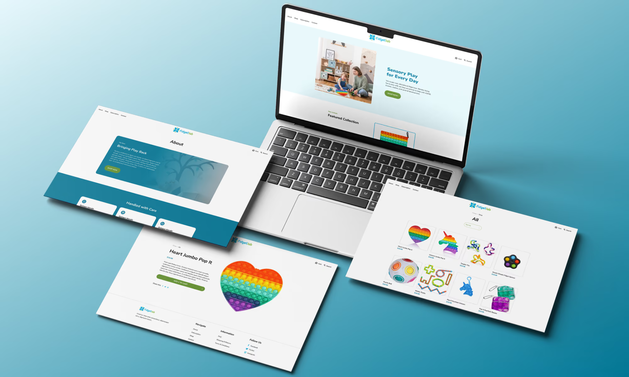

The client came into this expecting to start with a logo. We started with strategy instead: workshops, research, audience mapping, and creative direction before anything was drawn.
That order made a real difference. By the time the final logo was presented, it felt like a conclusion to a process the client had been part of, not a design being handed over for approval. They left with a clear sense of why every decision was made, which matters a lot for a small team who will be living with and applying the brand on their own going forward.
Let's talk about what you have on your mind


