
Although they go by 'Little' Caesars, they were quite a fast growing take away pizza chain that first opened up in Detroit, 1959. Since then the pizza company has started franchises all over the world, including Canada.
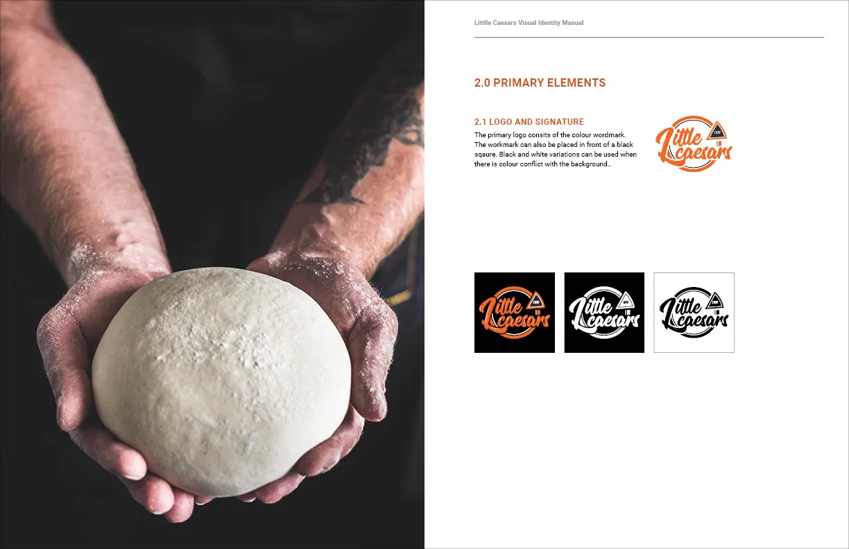
The original brand identity’s mascot character is iconic however, the design is well outdated and we were curious
to see what a modern take on the brand would look and feel like.
Core Values
Little Caesars Pizza is recognized among the value leaders in the food service industry.
We pride ourselves on our winning concept and products that uniquely meet our customers’ needs, plus create a strong value proposition for our franchisees.
The target audience of Little Caesars are students, adults, and families on a budget and on the go.
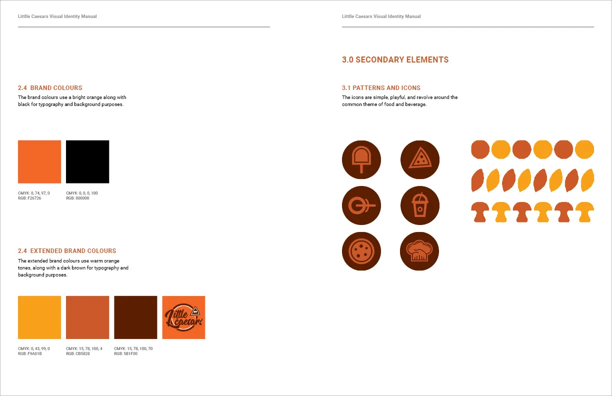
The brand will continue to have a fun and happy tone of voice that will attract youth and families. The colours will create a sense of warmth, comfort, and friendliness. Although the character from the logo was removed, the icons bring the cartoon essence back to the brand identity.
Quick, convenient, friendly, quality, leadership, franchise, international, pizza, lunch, fun, affordable,
take away, delivery, and memorable.

Mission Statement
Little Caesars wants to be “the best take-home pizza chain by exceeding customer expectations with extraordinary value, great tasting products and outstanding people.”