
The old website was initially developed using a pre-built template which was then modified. However, it was incomplete, inconsistent in branding, and didn't have a clear purpose behind the portfolio. The messaging was unclear, and lack of thought process in the case studies was not ideal for communicating the solutions clearly to the intended target audience.
Since my personal branding also needed a brand refresh, I used the opportunity to rethink the strategy, messaging, and built a personalized user experience for my portfolio site.
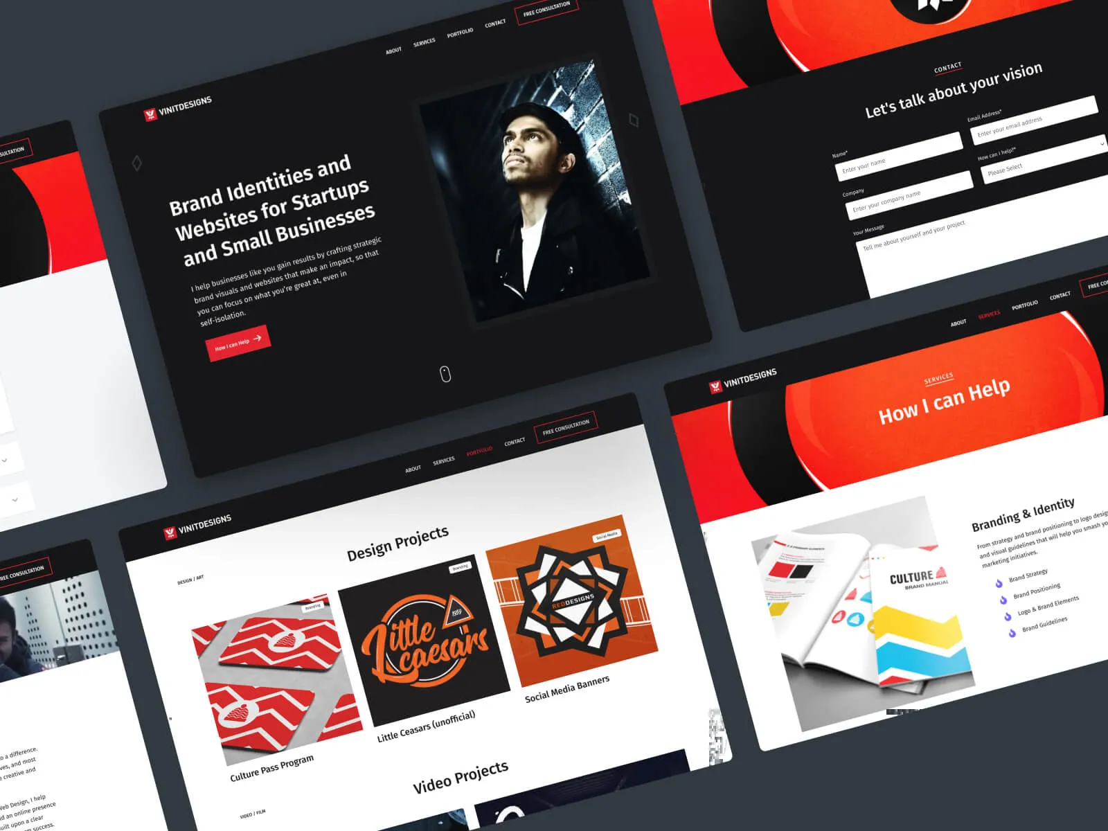
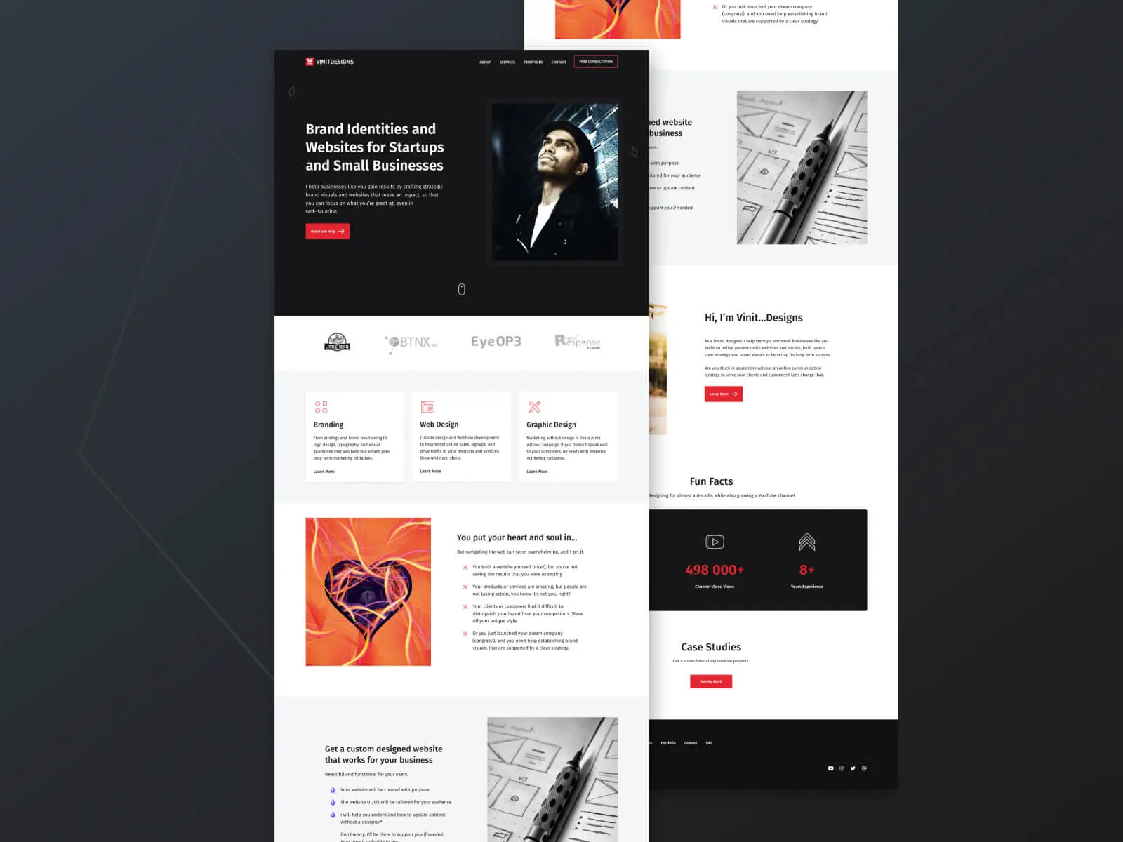
The goal of the website was to present my design work in professional and well thought out case studies so that potential employers and clients can reach out with ease. The site should also bring out my personal brand and personality as it is essential to differentiate myself.
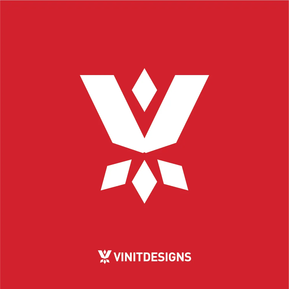
These were some of the digital logo concepts that were designed during the iteration stage. The brand identity needed to represent warmth, boldness, strength and stability, while maintaining its original "V" structure.
The final brand identity system has a few logo lockup variations that can be used on various mediums. Black and Red are the primary colours, while purple will be used as an accent colour.


The brand identity logo was brought to life with an epic intro design.
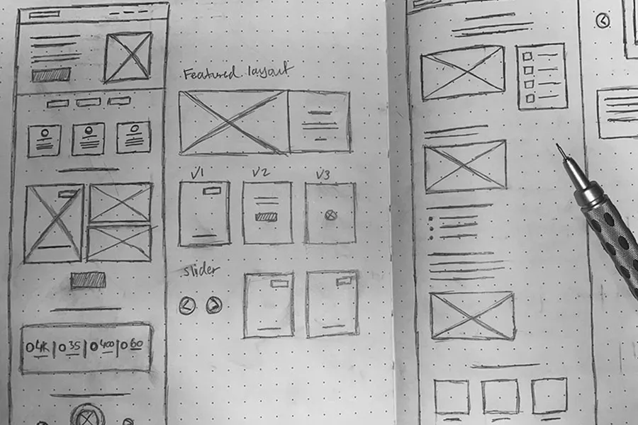
Before diving into Figma to design, I created user flows and wireframe structures on paper so that I could explore many ideas efficiently.
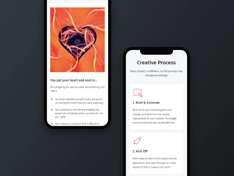
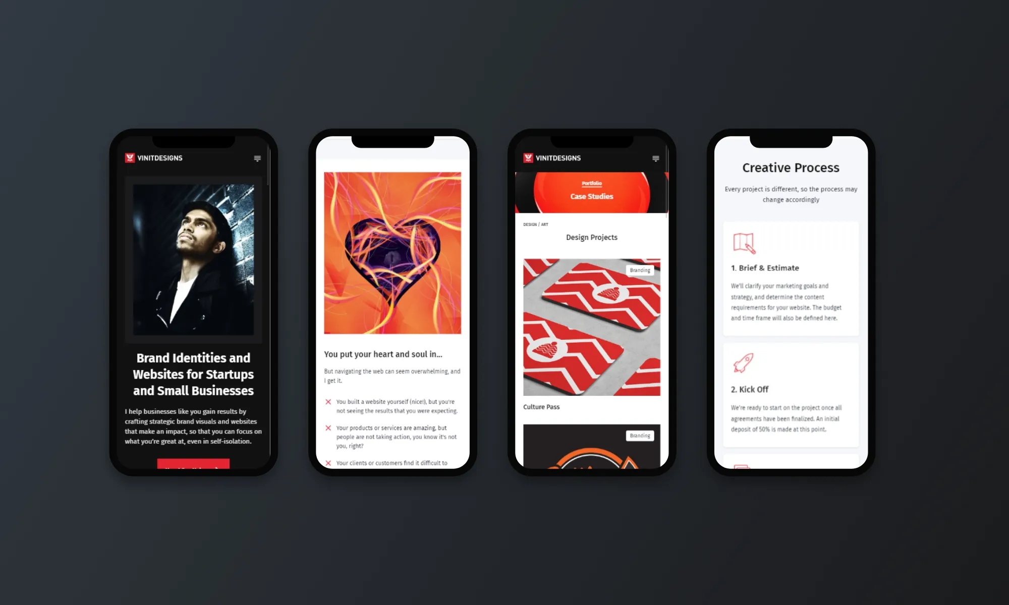
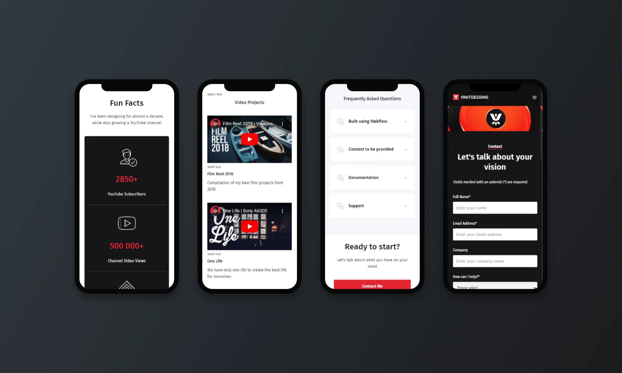
A responsive and mobile friendly design is a must for any digital experience. I ensured to follow best practices to create functional and user friendly layouts for desktop, tablet, and mobile devices.
Once the final Figma design mockups were complete, I built out the website using Webflow. I documented the process as I went page by page, which you can view below.
The new brand system allowed me to explore different social media brand elements and photography for Twitter, Linkedin, and YouTube.

Let's talk about what you have on your mind